Idea Innovation Hub
Improving the submission and voting experience
Year
2023-24
Length
1 year 8 months
Type
Professional
Collaborators
Research, Sales leadership, Client experience & Developers
All visuals, names, and details have been anonymized to protect proprietary content. The client experience team tasked us with redesigning to improve their Idea Innovation Hub on their website. Their goals for this project were to decrease clicks required to see ideas, increase ability to search for ideas, and enable users to vote for an idea without opening one. They also had some lower priority goals were to update UI to match the rest of the website and reduce the amount of duplicate ideas.
Research
We began with a heuristic evaluation and competitive analysis, followed by mapping the ideal user flow. Working with our research team, we conducted six user interviews to evaluate pain points in the current experience and gather initial feedback on our redesigned flow.
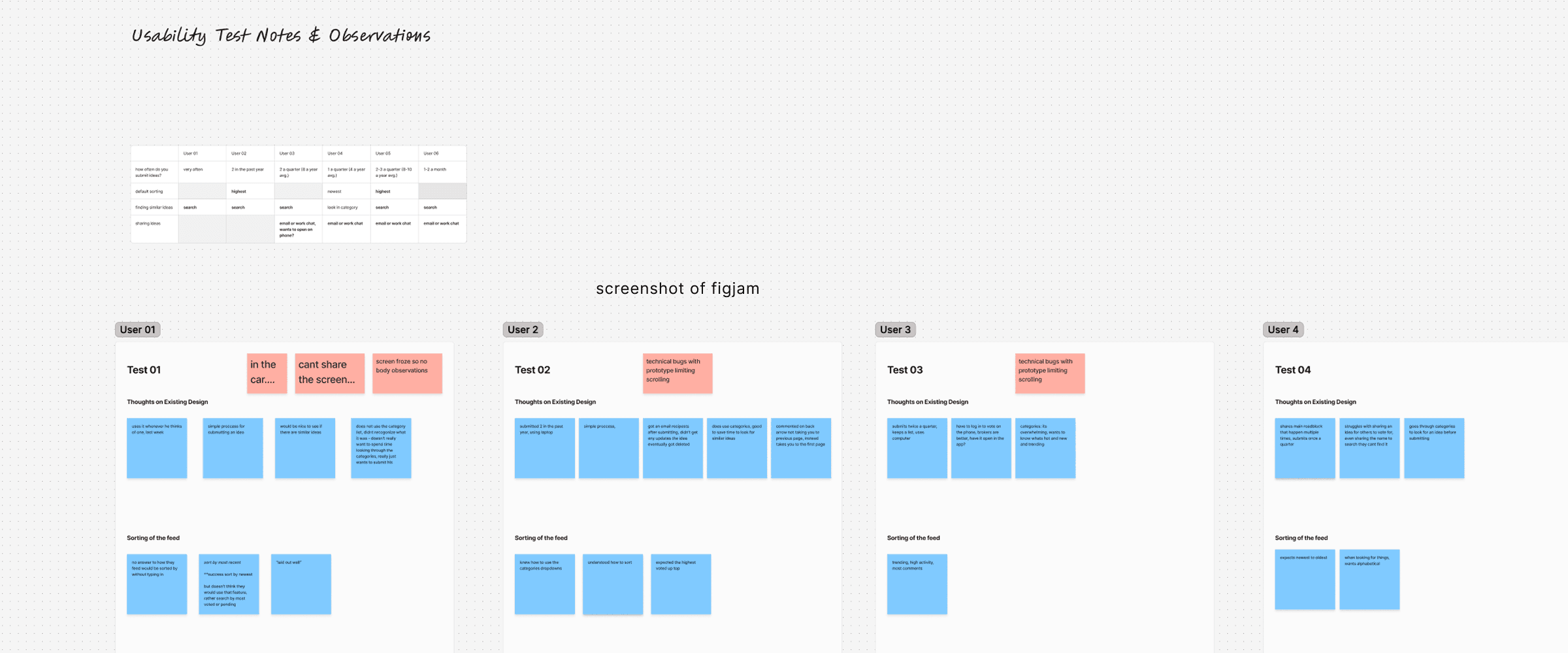
Key findings: Search behavior: 5 of 6 participants relied primarily on the search field to find ideas. Sharing behavior: 4 of 6 participants frequently shared idea links via email or work chat. Category overload: Most users found the long list of categories overwhelming and rarely used it.
Research
We began with a heuristic evaluation and competitive analysis, followed by mapping the ideal user flow. Working with our research team, we conducted six user interviews to evaluate pain points in the current experience and gather initial feedback on our redesigned flow.
Key findings: Search behavior: 5 of 6 participants relied primarily on the search field to find ideas. Sharing behavior: 4 of 6 participants frequently shared idea links via email or work chat. Category overload: Most users found the long list of categories overwhelming and rarely used it.
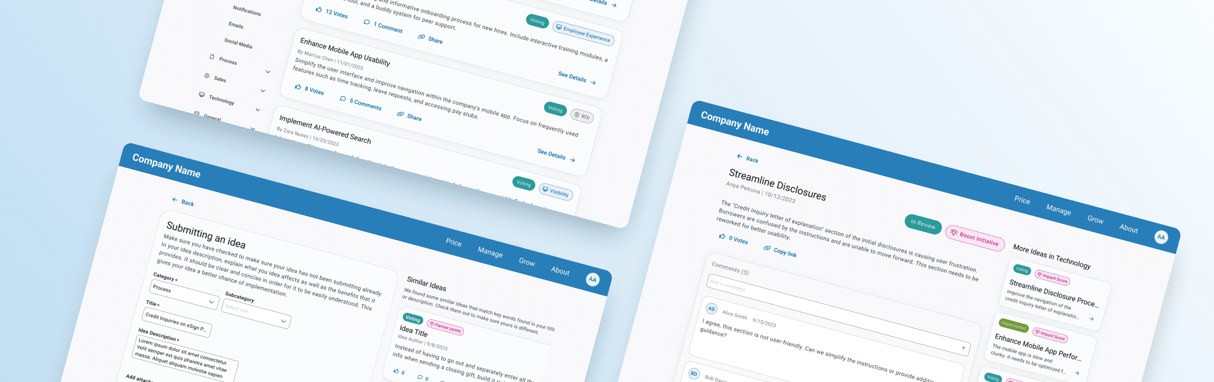
Reduce number of clicks to see ideas
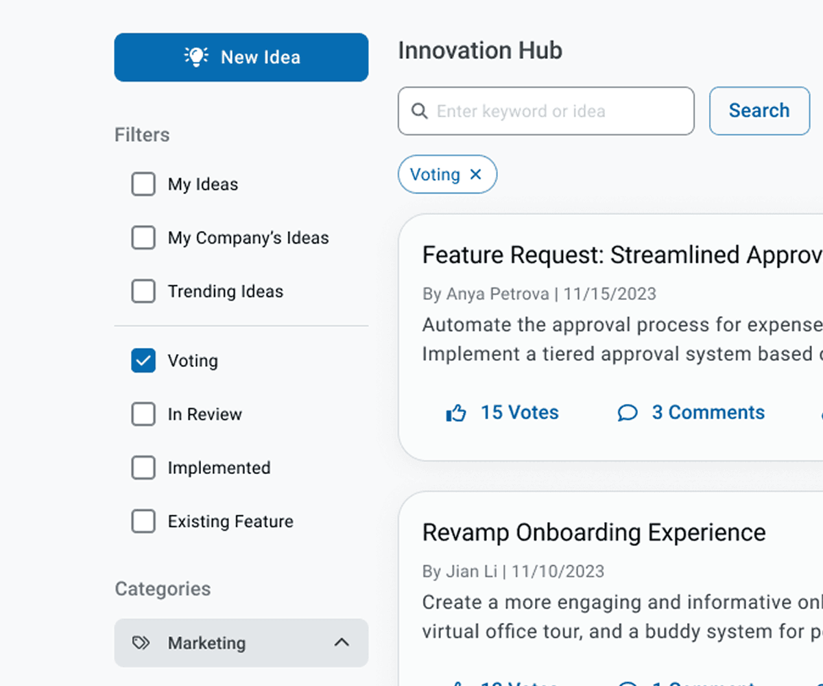
The original experience limited the page to 10 ideas per view with no filtering or sorting options. A sidebar presented 30+ categories in an unorganized list, creating friction for users trying to browse or discover relevant ideas. Because the number of categories could not be reduced, we introduced 7 main categories, each of which expands into subcategories. We collaborated with the Partner Experience team to rename categories and subcategories to better reflect user expectations.
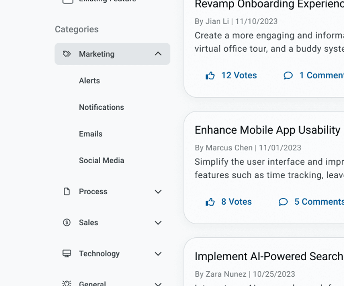
Additionally, based on interview insights, we added quick filters such as: - Ideas from users at the same company - The user’s own submitted ideas - Trending ideas To further improve browsing, we added a sort control with options for newest, oldest, most votes, and least votes. Pagination was updated to allow users to set the number of ideas shown per page.
Reduce number of clicks to see ideas
The original experience limited the page to 10 ideas per view with no filtering or sorting options. A sidebar presented 30+ categories in an unorganized list, creating friction for users trying to browse or discover relevant ideas. Because the number of categories could not be reduced, we introduced 7 main categories, each of which expands into subcategories. We collaborated with the Partner Experience team to rename categories and subcategories to better reflect user expectations.
Additionally, based on interview insights, we added quick filters such as: - Ideas from users at the same company - The user’s own submitted ideas - Trending ideas To further improve browsing, we added a sort control with options for newest, oldest, most votes, and least votes. Pagination was updated to allow users to set the number of ideas shown per page.
Increase search-ability
The original search function only returned categories and a limited set of keywords, which did not align with user expectations.
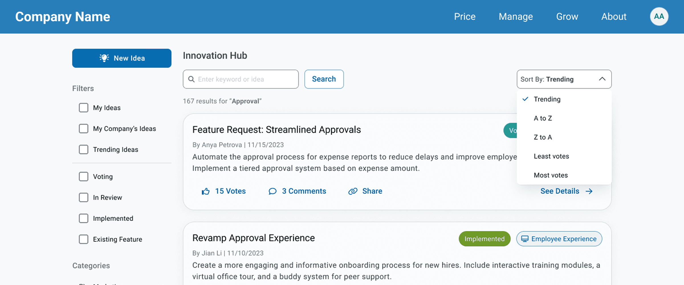
We partnered with the development team to expand search capabilities to include: - Full keyword matching - Updated category and subcategory names - User and submitter names - Idea titles and descriptions This ensured that search behavior accurately pulled from the types of information users were actively seeking.
Increase search-ability
The original search function only returned categories and a limited set of keywords, which did not align with user expectations.
We partnered with the development team to expand search capabilities to include: - Full keyword matching - Updated category and subcategory names - User and submitter names - Idea titles and descriptions This ensured that search behavior accurately pulled from the types of information users were actively seeking.
Enhancing Submitting & Voting
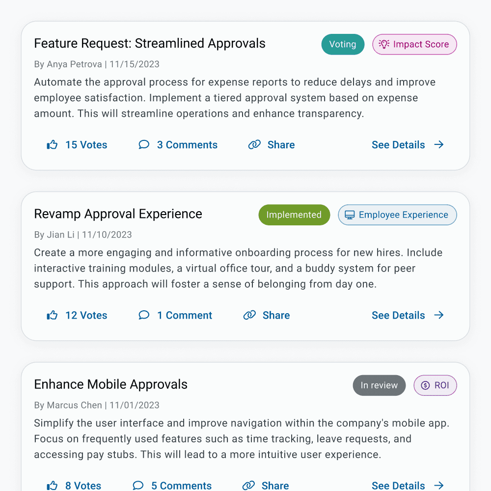
Previously, users had to click into an idea to vote or comment, and sharing required manually copying the browser URL. Participants in our study expressed a need for simpler sharing options and clearer voting interactions. We redesigned each idea card in the feed to include Like (vote), Comment and Share actions. The layout takes inspiration from familiar social media patterns, helping users immediately understand how to interact with an idea. All participants successfully completed voting tasks during testing.
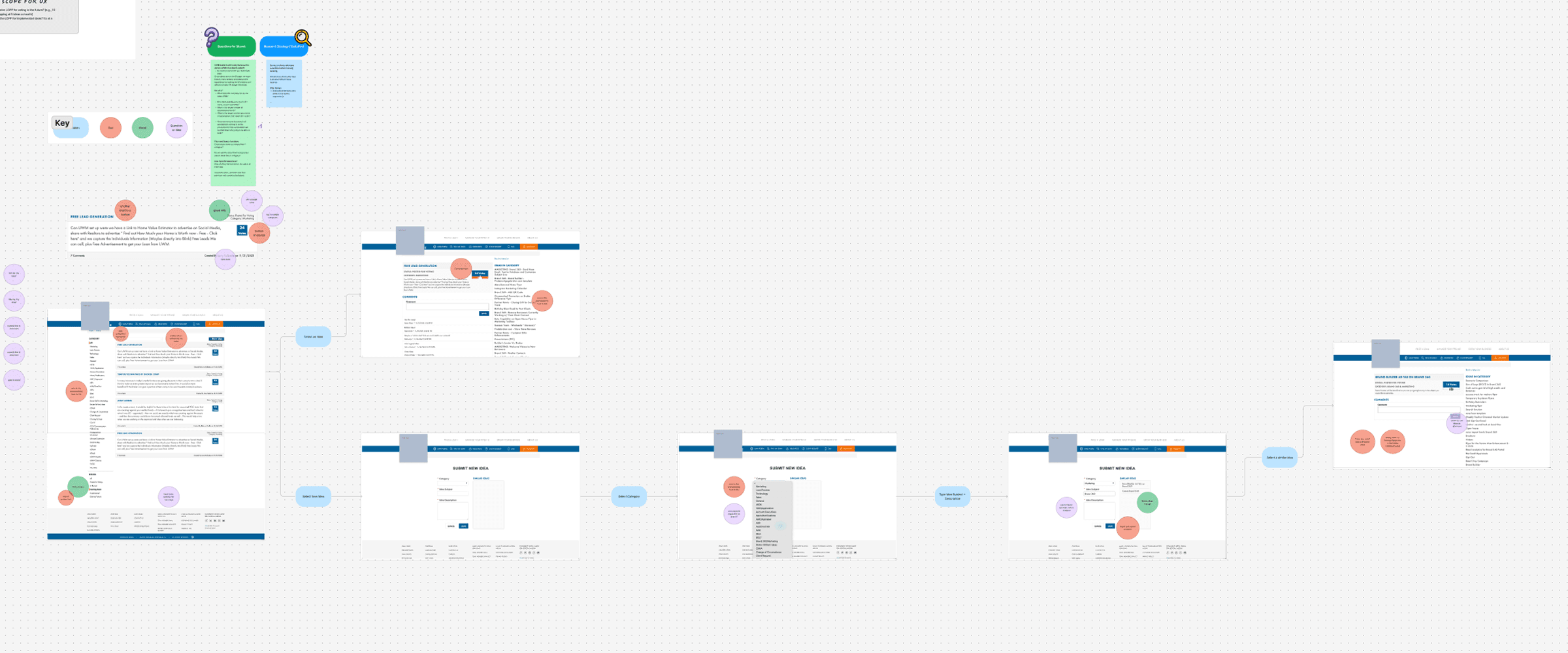
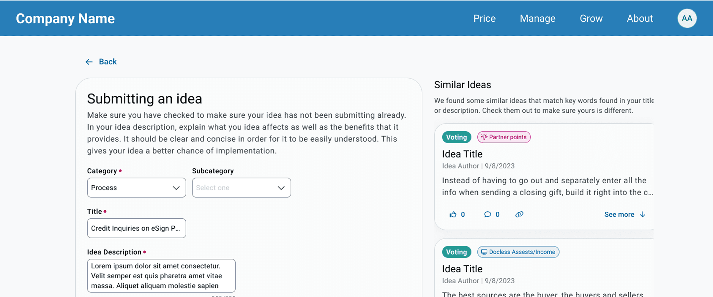
Duplicate ideas were a major internal pain point due to unclear categories and limited search functionality. To address this, we: - Improved backend matching logic for idea titles, descriptions, keywords, categories, and subcategories - Redesigned the submission form to display similar ideas based on what the user enters - Allowed users to preview similar ideas’ titles, descriptions, and comments without leaving the page - Included an option to open the full idea in a new view if needed This ensured users could easily confirm whether their idea already existed before submitting.
Enhancing Submitting & Voting
Previously, users had to click into an idea to vote or comment, and sharing required manually copying the browser URL. Participants in our study expressed a need for simpler sharing options and clearer voting interactions. We redesigned each idea card in the feed to include Like (vote), Comment and Share actions. The layout takes inspiration from familiar social media patterns, helping users immediately understand how to interact with an idea. All participants successfully completed voting tasks during testing.
Duplicate ideas were a major internal pain point due to unclear categories and limited search functionality. To address this, we: - Improved backend matching logic for idea titles, descriptions, keywords, categories, and subcategories - Redesigned the submission form to display similar ideas based on what the user enters - Allowed users to preview similar ideas’ titles, descriptions, and comments without leaving the page - Included an option to open the full idea in a new view if needed This ensured users could easily confirm whether their idea already existed before submitting.


