Apex Realty Academy
Redesigning a dashboard and course selection experience
Year
2024-25
Length
8 months
Type
Professional
Collaborators
Research, Sales leadership, Client experience & Developers
Apex Realty Academy offers in-person and virtual training for a specific job. Their product team asked us to redesign the experience as they prepared to launch new courses and add more features. The main goals were to create a dashboard that shows course progress and personalized suggestions, and to update the course search page. All visuals, names, and details have been anonymized for privacy.
Impact
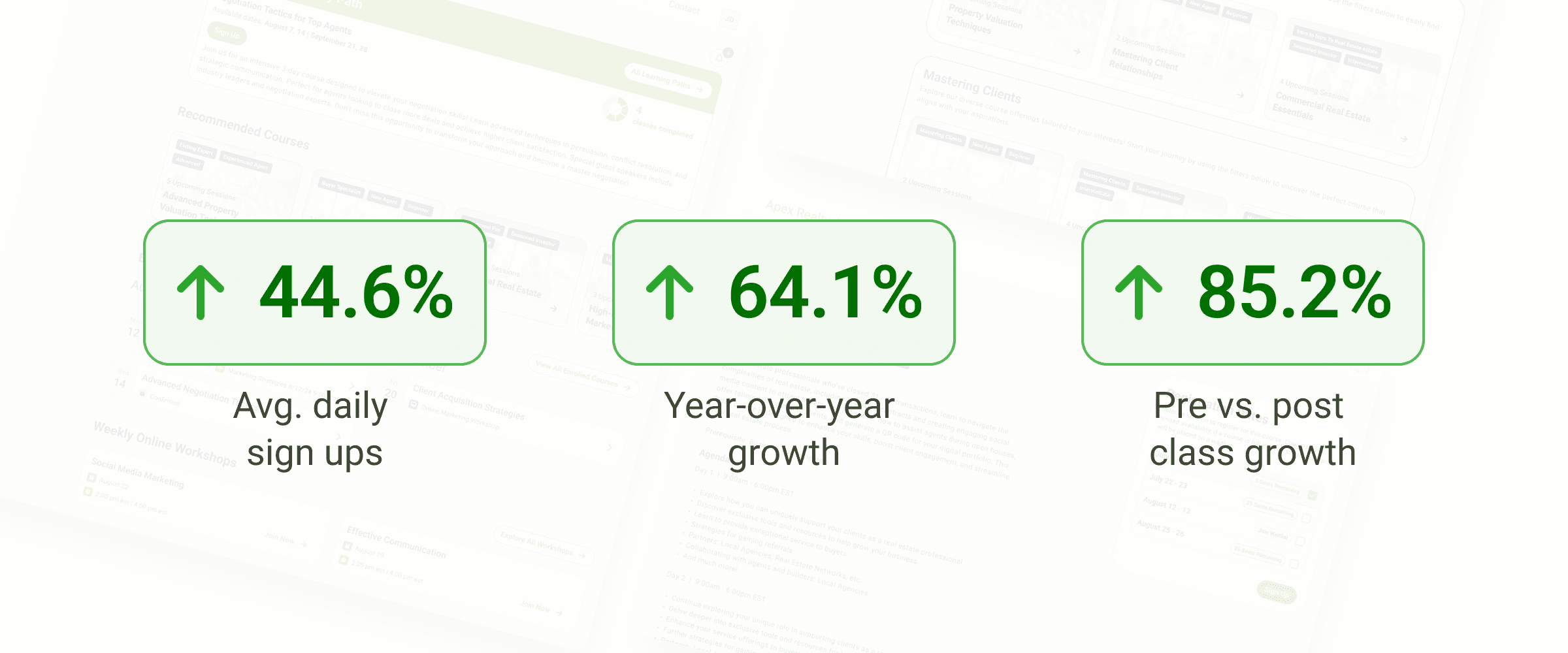
Since launch, average daily registrations increased by 44.7%, with a 64.1% increase compared to the same month the year prior. Individual classes also saw an average 85.2% increase in registrations when comparing pre- and post-launch performance. While the redesigned experience improved discovery and usability, this growth was also driven by the restructuring of the curriculum and the addition of new classes and learning paths.
Impact
Since launch, average daily registrations increased by 44.7%, with a 64.1% increase compared to the same month the year prior. Individual classes also saw an average 85.2% increase in registrations when comparing pre- and post-launch performance. While the redesigned experience improved discovery and usability, this growth was also driven by the restructuring of the curriculum and the addition of new classes and learning paths.
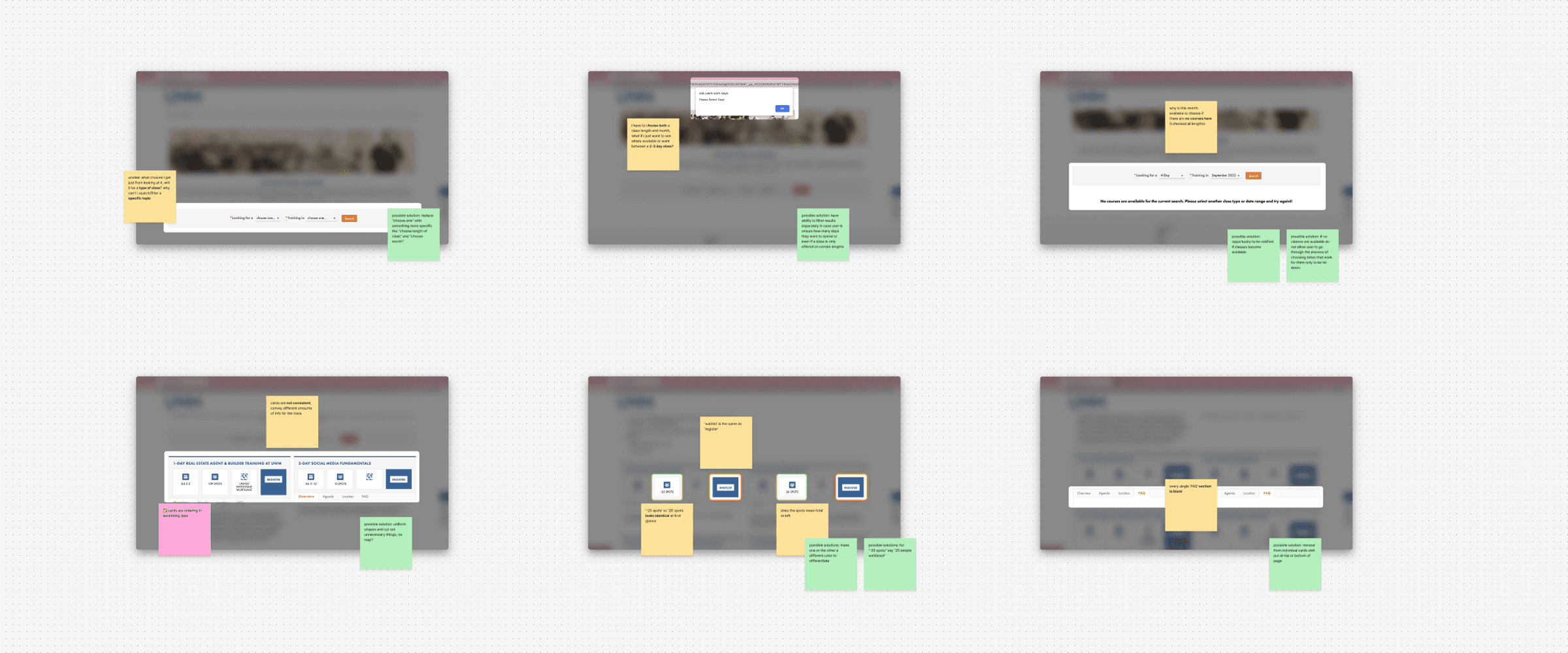
Heuristic evaluation of current site
The main pain points of the current site were an outdated interface that made the experience hard to follow with limited functionality that affected user freedom. Due to the team's already established goal to improve functionality, most of these pain points would be solved for.
Course searching
The team wanted to introduct new paths for classes which students can register for that aligned with their role or specific skills. The current way to search was to select both a class length (1-day, 2-day, 3-day, or virtual) and a month the classes were available (3 month periods at a time).
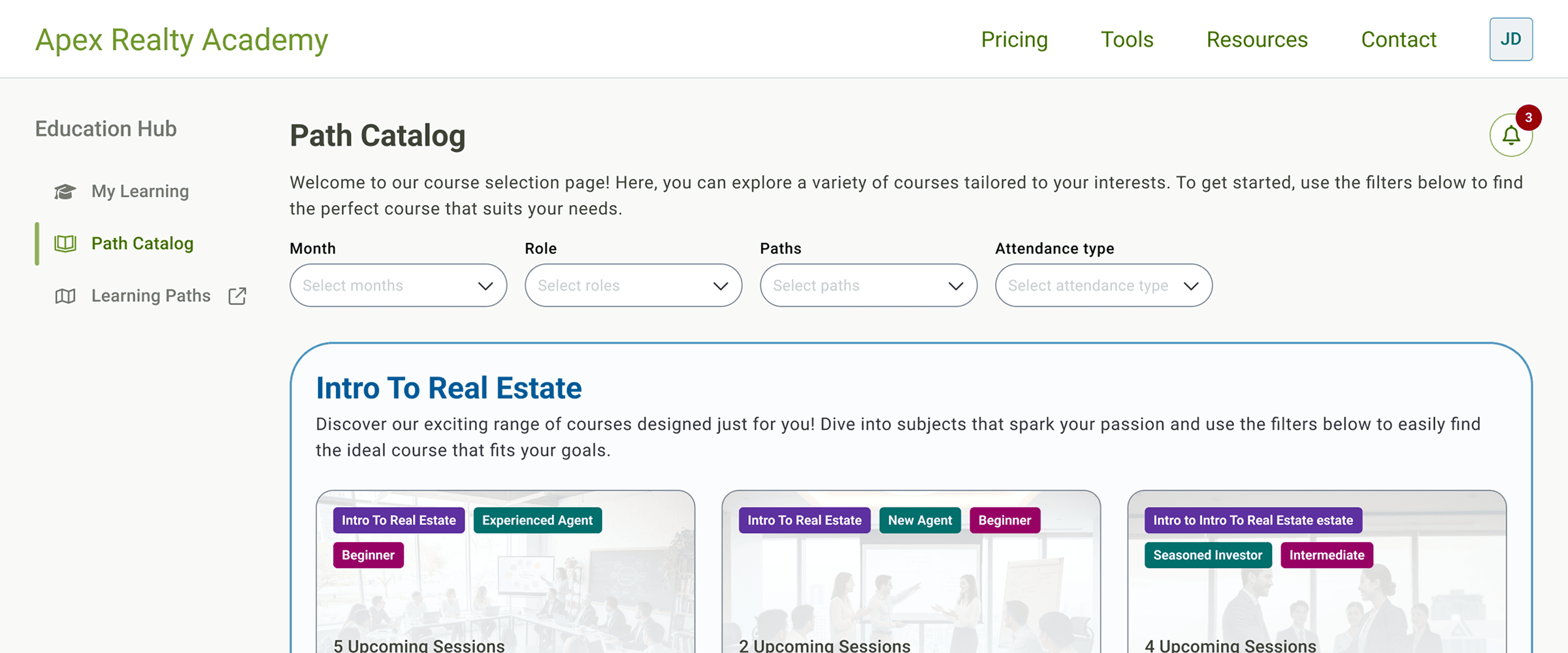
The improved functionality and design allowed students to find classes more easily. Now there is a page to view all classes, with the option to filter by available months, match classes to a role, view by path, and seat availablility.
Course searching
The team wanted to introduct new paths for classes which students can register for that aligned with their role or specific skills. The current way to search was to select both a class length (1-day, 2-day, 3-day, or virtual) and a month the classes were available (3 month periods at a time).
The improved functionality and design allowed students to find classes more easily. Now there is a page to view all classes, with the option to filter by available months, match classes to a role, view by path, and seat availablility.
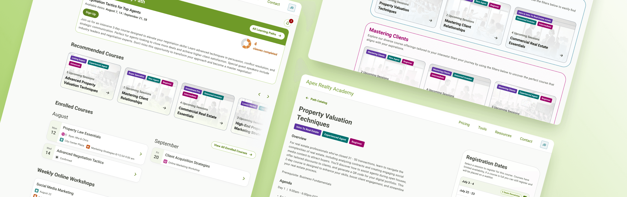
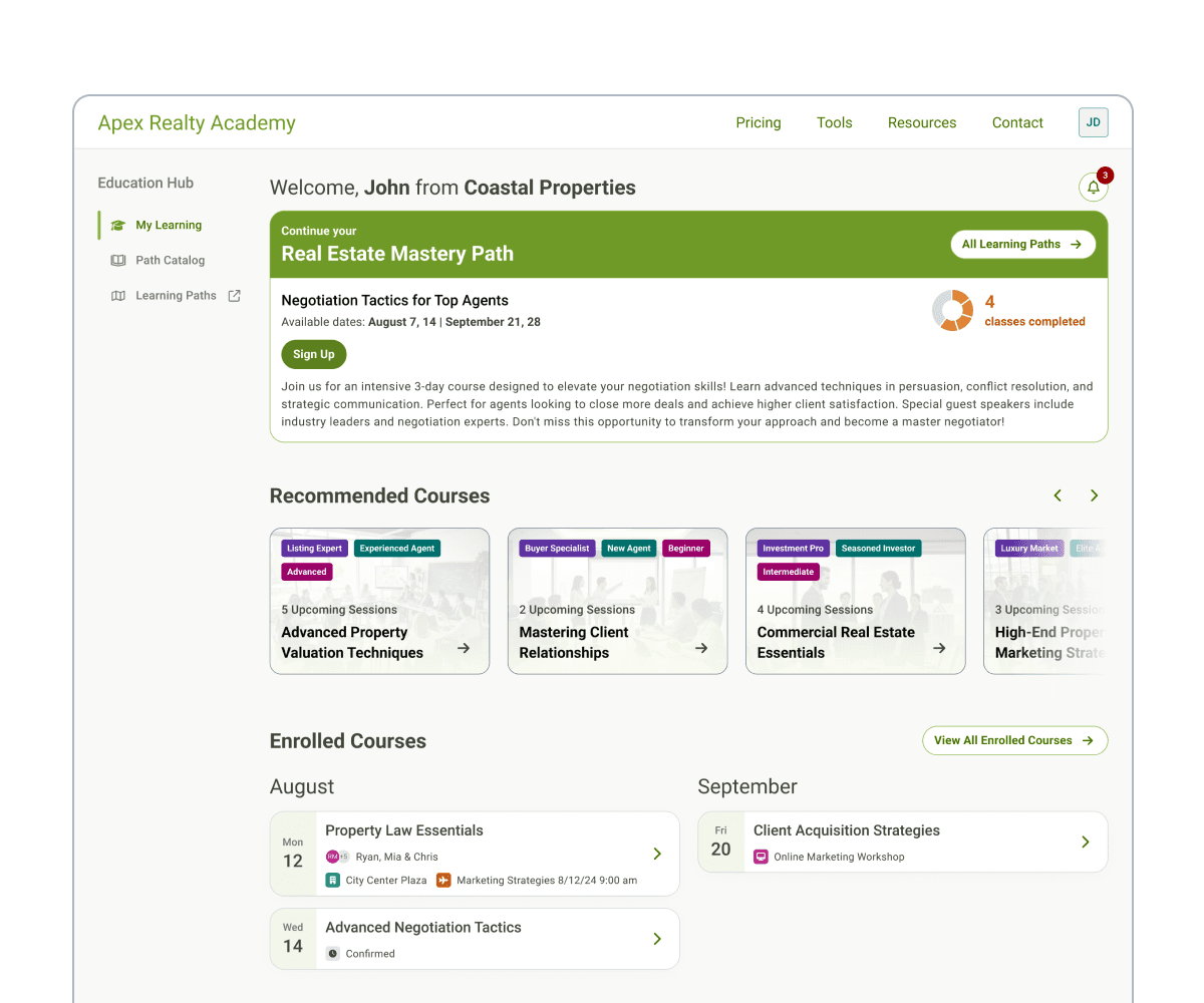
Personalized dashboard
To introduct the new paths and classes, the team wanted to add a dashboard for students to keep track of their progess, view dates and travel information, and see personalized class recommendations. Initial wireframes included a featured section showing the student's selected path and class. The class would either be for currently enrolled or the next class to enroll in the path. Other sections included a caursel of class suggestions based on the student's role or previous classes, a way to view dates/travel for upcoming classes and a weekly suggested virtual class.
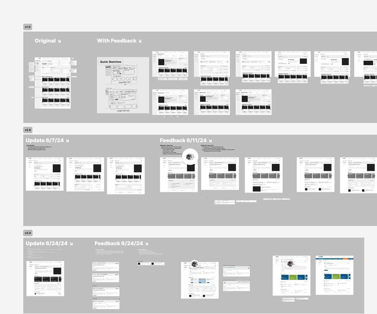
After iterating and recieving a change in requiremnts, the dashboard's featured section was refined to show percentage progress in a path, current/next class name, description, and action to enroll. Below this section is the personalized class suggestions. The calendar section was limited to showing the class name, start date, as well as travel information for hotels and flights. The virtual class section was added to the bottom and would rotate with new classes weekly, giving students a way to keep active in between in-person classes.
Personalized dashboard
To introduct the new paths and classes, the team wanted to add a dashboard for students to keep track of their progess, view dates and travel information, and see personalized class recommendations. Initial wireframes included a featured section showing the student's selected path and class. The class would either be for currently enrolled or the next class to enroll in the path. Other sections included a caursel of class suggestions based on the student's role or previous classes, a way to view dates/travel for upcoming classes and a weekly suggested virtual class.
After iterating and recieving a change in requiremnts, the dashboard's featured section was refined to show percentage progress in a path, current/next class name, description, and action to enroll. Below this section is the personalized class suggestions. The calendar section was limited to showing the class name, start date, as well as travel information for hotels and flights. The virtual class section was added to the bottom and would rotate with new classes weekly, giving students a way to keep active in between in-person classes.


