Dream Design System
A multi-brand design system built with scalability at the forefront.

Year
2024 - Present
Length
Ongoing
Type
United Wholesale Mortgage
Collaborators
Developers, Product Managers, Product Designers
The Dream redesign began as a standalone effort but evolved significantly when UWM combined all its technologies into a unified application. This integration shaped the design system’s trajectory, requiring updates to the token structure and system architecture to support the new product.
Primitives
We migrated United Wholesale Mortgage's design system to custom components using design tokens. This enabled seamless translation to code, something the previous system did not provide. The Dream redesign began as a standalone effort but evolved significantly when UWM combined all its technologies into a unified application. This integration shaped the design system’s trajectory, requiring updates to the token structure and system architecture to support the new product. I took on the responsibility of the creation of foundational tokens and guidelines for color, spacing, and layout.
Variable mapping
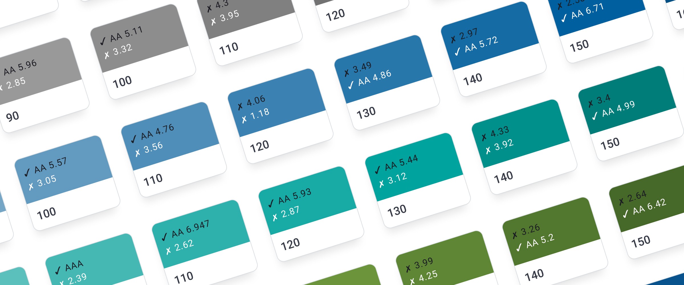
The new base, or primitive, colors are based on hue scales for flexible component design. These primitive colors mapped to semantic roles for text, fill, outline, and icon. Each had subcategories for colors like neutral, brand, action, and feedback. Text colors were checked for WCAG AA accessibility, sparing designers from manual checks as they used colors. This mapping took the guess work when we created components and when designers used the system.
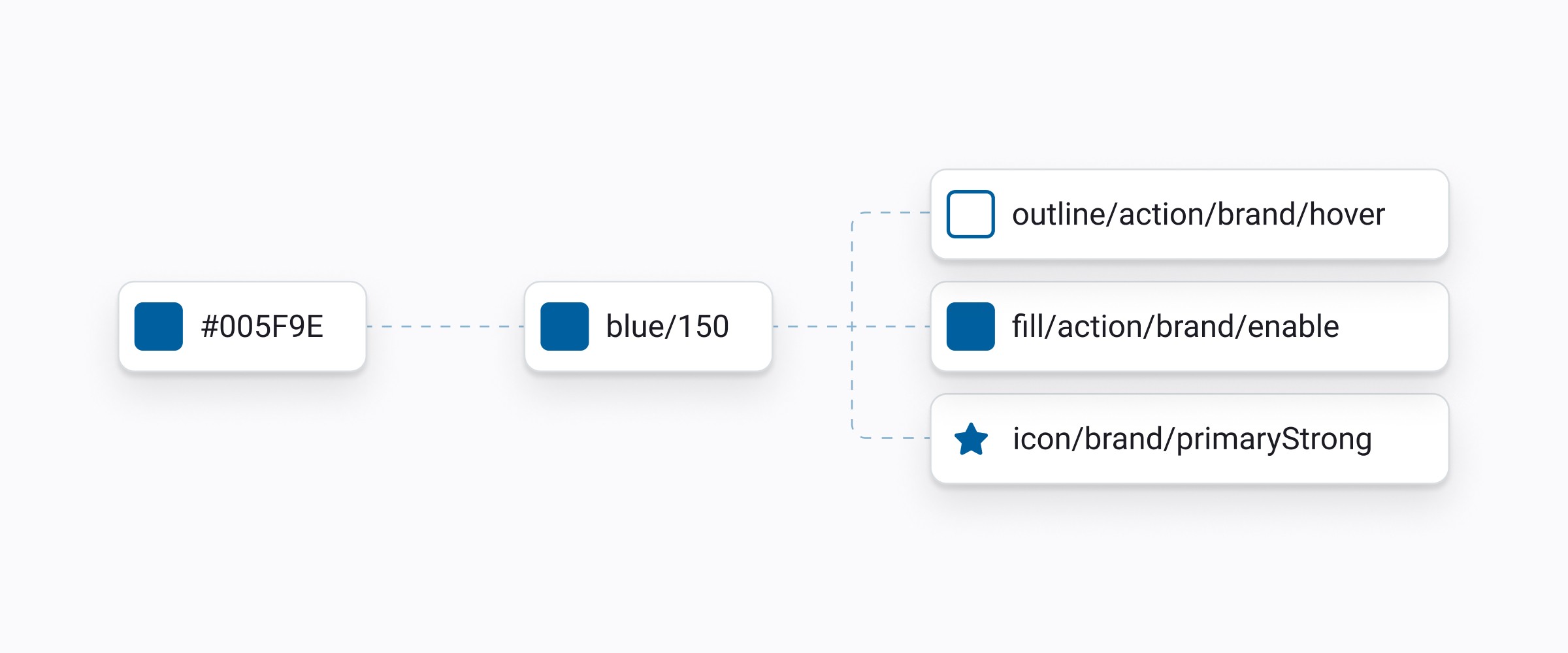
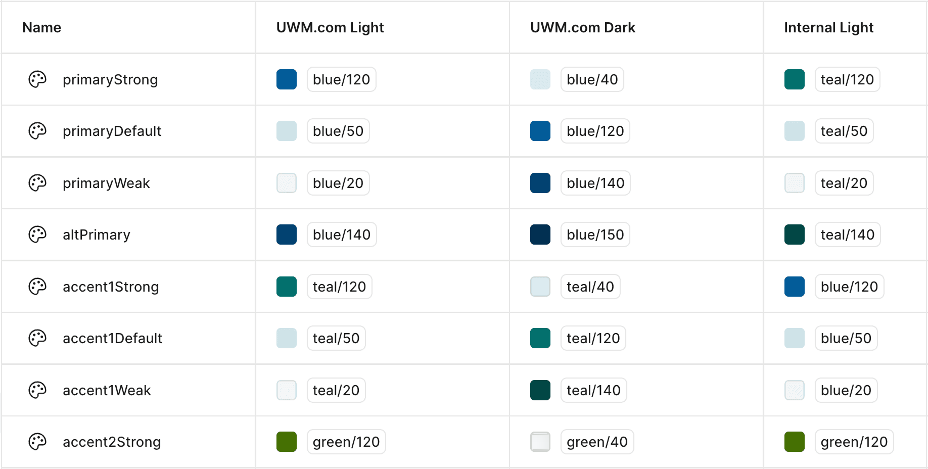
With so many products at UWM, using Figma's variable modes was going to prove very useful as the system scaled. The semantic variables were split into not only light and dark modes, but different products were able to consume a custom theme by attaching different primitive values. Our main application was able to consume blue as the primary color while our internal products used teal, letting designers connect to one library of components and styles.
Variable mapping
The new base, or primitive, colors are based on hue scales for flexible component design. These primitive colors mapped to semantic roles for text, fill, outline, and icon. Each had subcategories for colors like neutral, brand, action, and feedback. Text colors were checked for WCAG AA accessibility, sparing designers from manual checks as they used colors. This mapping took the guess work when we created components and when designers used the system.
With so many products at UWM, using Figma's variable modes was going to prove very useful as the system scaled. The semantic variables were split into not only light and dark modes, but different products were able to consume a custom theme by attaching different primitive values. Our main application was able to consume blue as the primary color while our internal products used teal, letting designers connect to one library of components and styles.
Building the components
The components now utilize properties more efficiently. The previous iteration of the design system had components with vaugue properties called “color”, which made it unclear when designers should use each option. This led to components like button appearing differently across different applications.
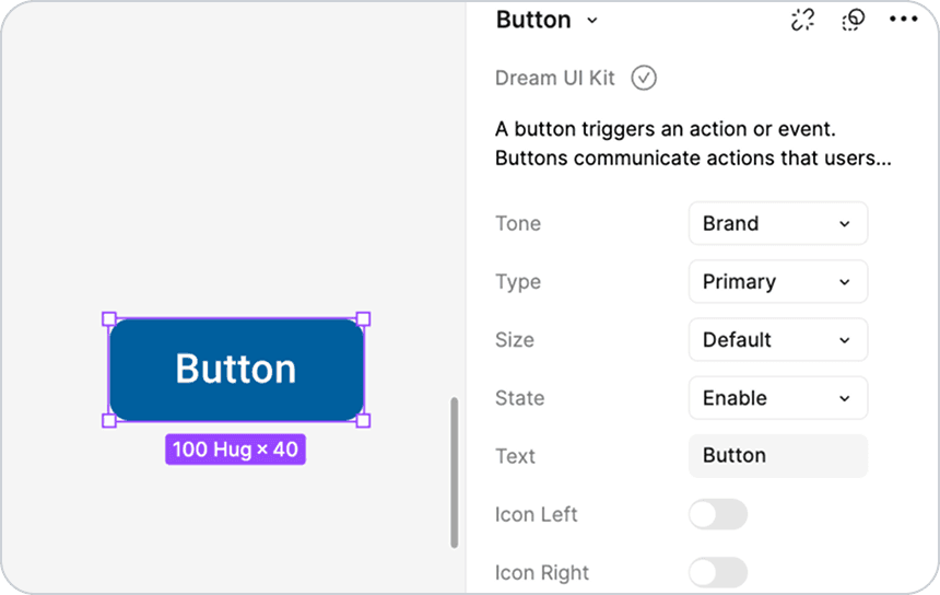
In the new system, component properties are role-based. Designers choose between tones such as 'brand' or 'destructive' based on use case. The type property determines emphasis between 'primary', 'secondary', and 'tertiary'. Properties like these are consistent across products and components come with usage guidelines on how to use them.
Building the components
The components now utilize properties more efficiently. The previous iteration of the design system had components with vaugue properties called “color”, which made it unclear when designers should use each option. This led to components like button appearing differently across different applications.
In the new system, component properties are role-based. Designers choose between tones such as 'brand' or 'destructive' based on use case. The type property determines emphasis between 'primary', 'secondary', and 'tertiary'. Properties like these are consistent across products and components come with usage guidelines on how to use them.
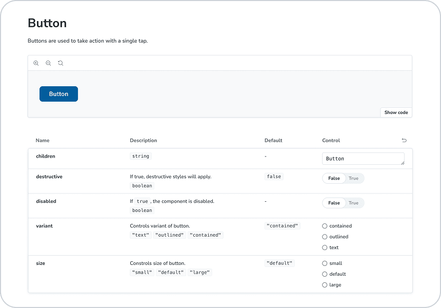
Design to code
To transform this UI kit into a real design system, we exported the variables and created a code repository documented in Storybook. Designers use the Figma UI kit while developers can reference the exact same components in Storybook for the code.
The Dream Design System is an ever evolving product. The team monitors communication channels amongst designers and developers to see where improvements can be made on both sides. As more products adopt Dream, we learn new ways to adapt to challenges.


 Download resume